Revamping Melbourne’s most innovative neobank
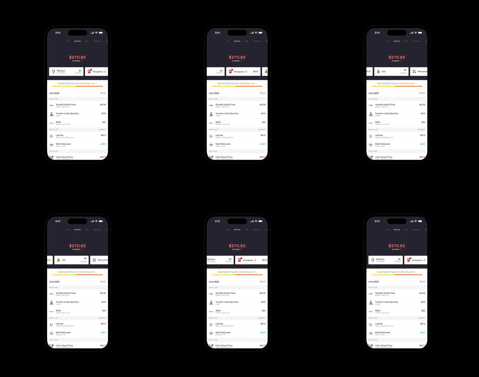
Up is neobank founded in 2018, the bank is a collaboration between software development company Ferocia and Bendigo and Adelaide Bank. As a regular user of Up, I wanted to highlight some aspects of the UI/UX that I believed could be ehanced including surfacing additional transactional data via API integration with POS such as Mr Yum and Square.
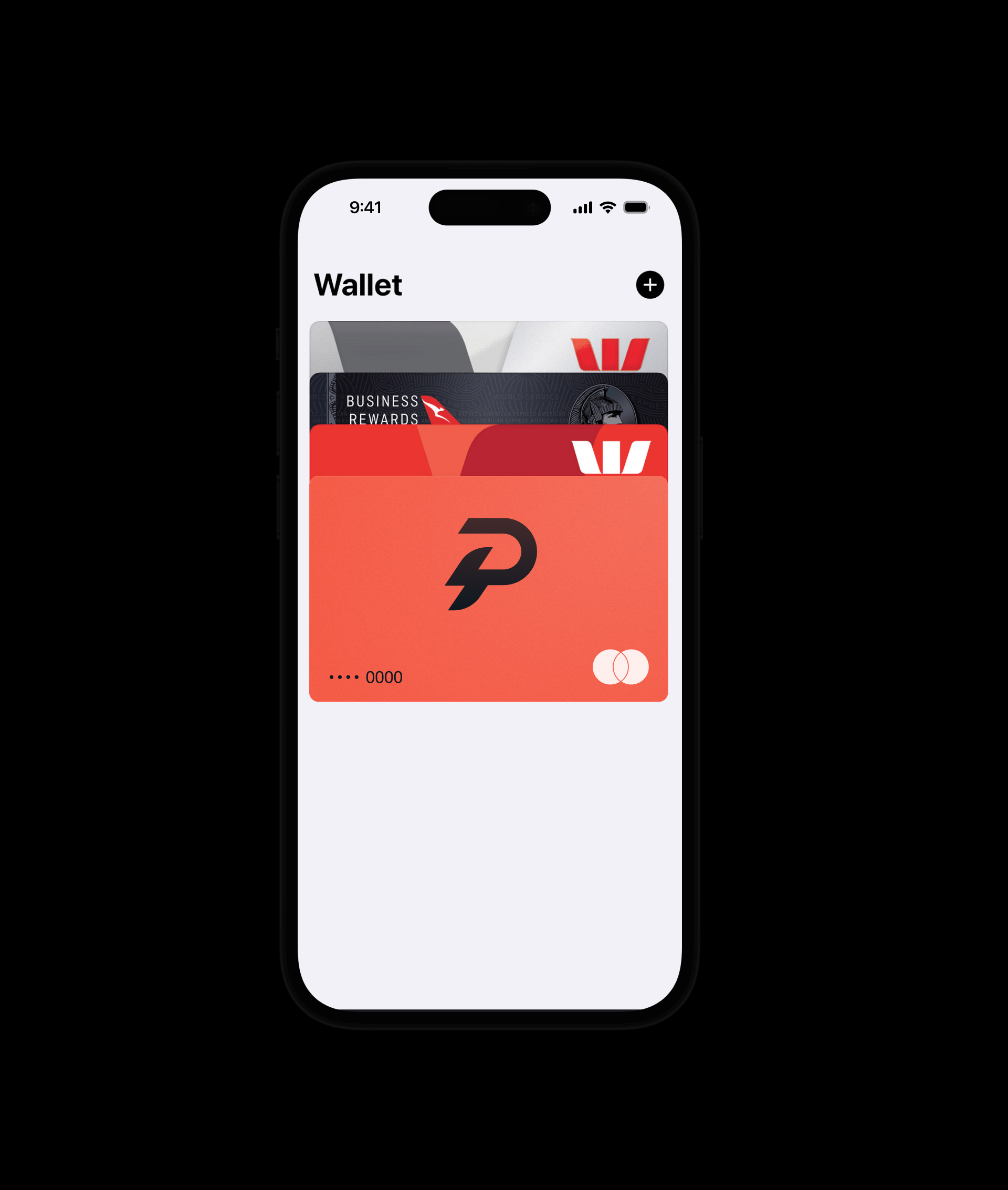
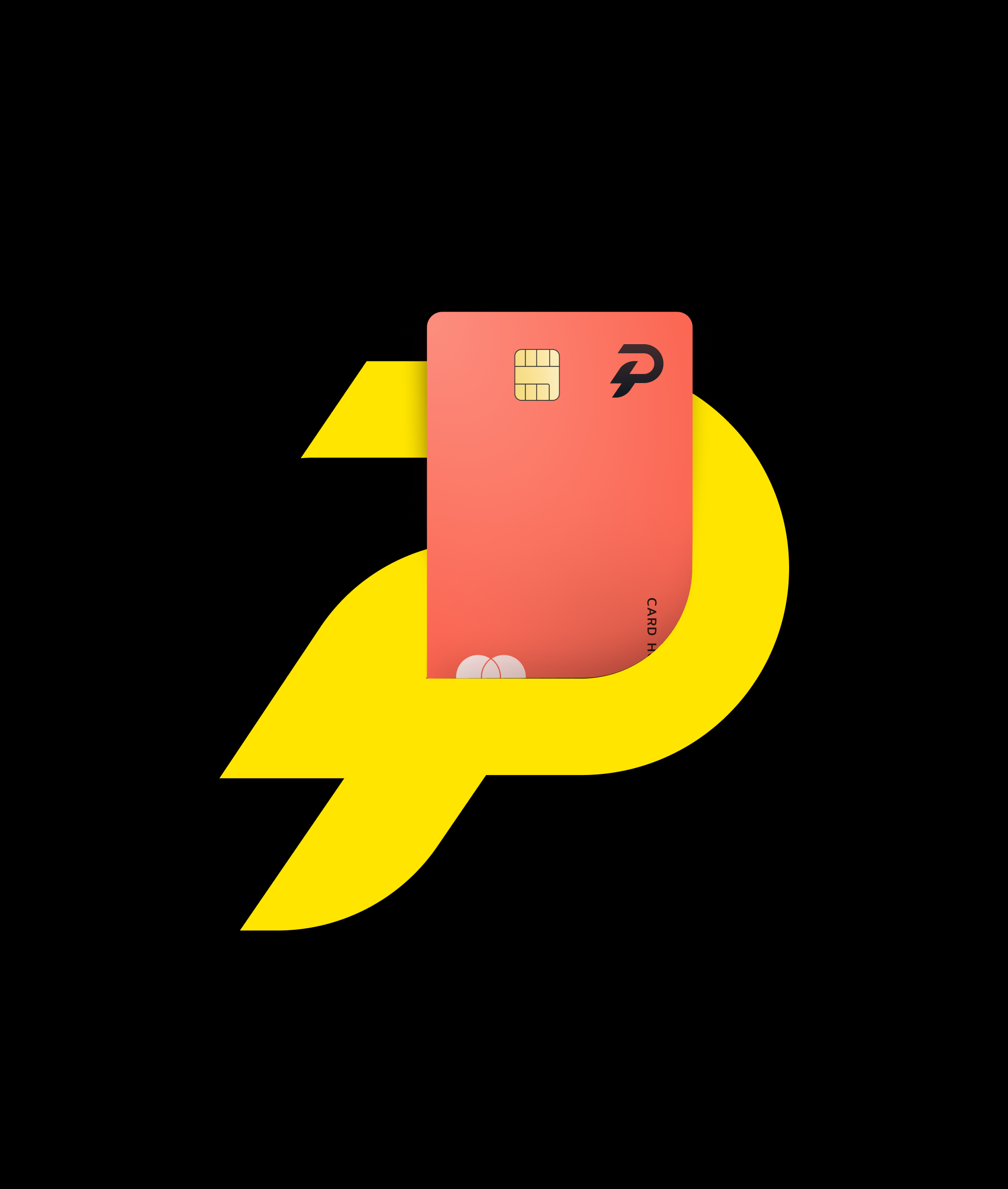
In the spirit of a revamp, I also developed an identity that embraces the bold dynamism associated with neobanks. This included the use of 3D models, colour treatment, as well as a revised mark and logotype.


Smart receipts and slices
In addition to tweaking Up’s brand and logomark, I also wanted introduce a new feature to the product. Pulling inspiration from Up seemless integration with AfterPay to log BNPL transactions, I wanted to see this integration extended to Square and Mr Yum to surface additional transactional data for more accurate paysplitting.
By mapping Up’s own Maybuys and Slices features, I was able to leverage existing patterns in the app with additonal meta-data and details to further contextualise your tranasctions. The goal was to reduce friction at the payment counter along with hanging on to physical receipts for paysplitting.
By mapping Up’s own Maybuys and Slices features, I was able to leverage existing patterns in the app with additonal meta-data and details to further contextualise your tranasctions. The goal was to reduce friction at the payment counter along with hanging on to physical receipts for paysplitting.